TN5250 Terminal UI: retrospective and Web UI attempt
I’d like to explore if having a webui like a old TN5250 screen could be more efficient in some cases.
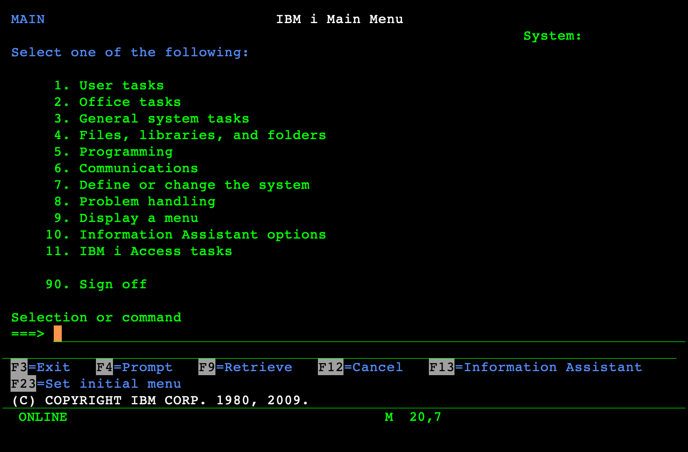
1. TN5250
TN5250 and curses interfaces look a bit similar, but IBM managed to unify a lot their TUIs at the time.
This allowed driving those UIs with keyboards very efficiently.
Some typical features we could find:
-
Very limited style based on monospace fonts
-
Some limited colour use and text case use to differentiate parts of the screen
-
Scrolling is page-based
-
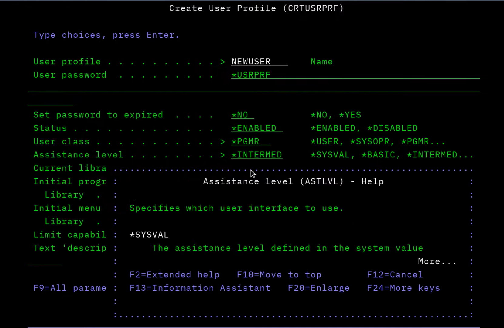
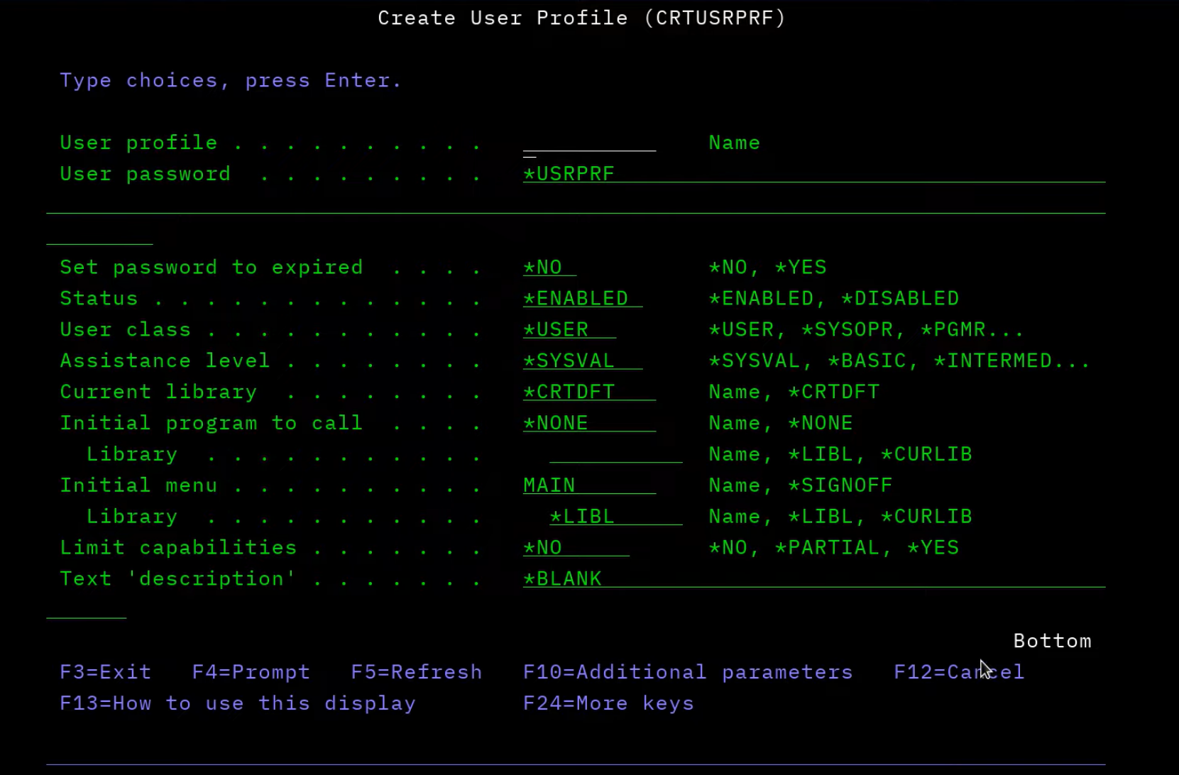
F4 prompting allows filling parameters of commands with several level of details
-
Using Function keys always described at the bottom of the screen to give a contextual menu of what is possible
-
F1 is showing a modal of the help for the current field/screen/thing selected on screen
-
Moving between fields with arrows
-
Screen Design Aid (SDA) allows to create a screen by writing text on the screen directly
2. NCurses
ncurses is a C library that was designed to create some TUIs on Unix/Linux.
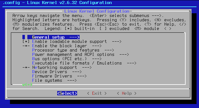
Some typical features:
-
Use of saturated colours
-
UI elements tend to be more complex
-
Selected element/button more visible
-
Every window seems to be hovering pretty high with a drop shadow
-
Lack of common F-functions common shortcuts
-
Arrows movement
-
Upper-case letters in different colour within a given context allows jumping to that element directly
3. Inspired UI
Those types of UI can be very efficient for keyboard use, and they are really minimalist.
Following them, we can include some of their ideas on the web:
-
Use a monospace font everywhere
-
Keep all elements aligned
-
Limited use of colours (with default dark theme)
-
Keyboard shortcuts displayed at the bottom of the page at all times
-
Show “hover” descriptions in a modal (like F4 prompt) for each field
-
Try to adapt it for mobile as well
-
Remove scrolling and work in pages only (maybe)
4. Result
Overall, it’s an interesting test, and here are some random remarks about it:
-
the old style is similar is somewhat achievable in CSS, even though not the main purpose;
-
the html contains many dialogs hidden by default with an id that can be computed from the id of the input field itself: that was easier to implement that expected;
-
the idea of having a detailed help available for each field on a key is very nice, and much better than a limited hover text on most sites (can be used to display huge error messages too);
-
the color contrast is very high throughout;
-
using color with italics for currently selected label is both clear and simple for accessibility;
-
next/previous buttons at the bottom of the screen don’t work: it’s not easy to map them to Tab/Shift-Tab since clicking them moves the focused element away from the input field;
-
having the first field selected ready to be filled should be standard on the web;
-
styling native elements like select to fit-in is not trivial;
-
styling a checkbox into a YES|NO input is hard, so I used a radio button instead, and it works really well (the modal displayed can is different depending on if the user invokes it on the yes or on the no).
-
on mobile, it’s so-so as functions keys aren’t easily available. Not worked on it very much.